Coordinating wall colors with flooring and furniture will really pull the whole space together or serve as a beautiful backdrop. Considering material finishes, light, and size will join it all together.
At our firm, we help customers determine color strategies that complement their style, and these color choices then become an extension of their interior. Don’t hesitate to contact us at TurnKey Painters.
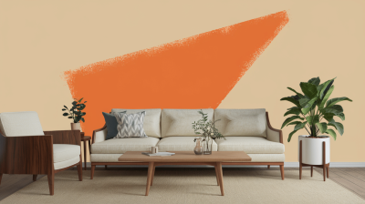
How to coordinate wall colors with the flooring and furniture. Consider undertone combinations, contrasting elements, temperature, and materials to be sure you are designing not only for style but also for function!
Understanding undertones in flooring and furnishings holds the key. The wood floor can be warm (red, yellow) or cool (blue, green). Warm floors should be matched with warm wall colors, and cool floors with cool colors. Neutral tones like beige are acceptable. Always test your paint samples against your flooring for the best match.
Contrast creates depth- it brings interest when light walls meet dark floors or when dark walls meet light floors to ground the room. We sometimes use contrasts to reinforce features, thereby needing to balance with gentler systems.
Walk color temperatures along with the feel of the room. Warm colors create coziness, and cool tones provide an airy feeling. Neutral ties balance between warm and cool colors in perfect harmony.
The rule states to use 60% of the dominant color (usually walls), 30% for secondary color, and 10% for accents. An example is cream white walls (60%), navy furniture (30%), and brass decor (10%).
Different materials would require selected color matches. Natural floorboards match soft colors, for example, sage green, and versatile colors like white for metal or glass furniture. Mismatch combinations would break that harmony.
Style, combined with functionality, has been created with consideration for these factors.

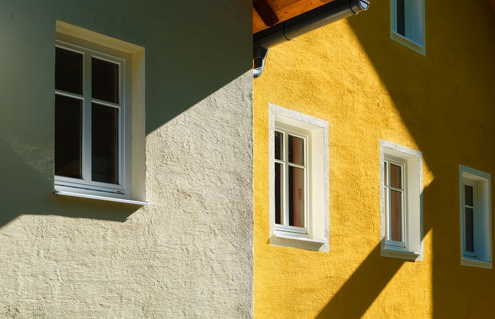
Each factor associated with the term “finish” in interiors encompasses a range of considerations, including, but not limited to, mere appearance. It concerns atmosphere and utility in relation to the individual rooms. The selected finish allows for the smooth correlation of certain wall colors, flooring, and the texture of furniture into one gorgeous and glorious space. This will cover the effect of finish selections on walls, floors, and furniture.
The different sheens serve different purposes. Matte finishes work for the walls of the living room and bedrooms, as they provide a smooth, non-reflecting surface that lowers imperfections and gives calmness to the room. Semi-gloss or gloss finishes are durable, easy to maintain, resist stains, and are apt for high-traffic rooms such as kitchens or baths. More importantly, the sheen of the walls must be in harmony with the light-the reflective surfaces will bounce off the light, making the rooms appear bigger, while matte finishes give a cozy feel. As a design rule, never mix finishes on a single wall for an uninterrupted aesthetic sense.
A floor finish anchors the whole design. Glossy finishes (polished wood or tile) exude glamour, whereas matte finishes (unpolished stone or distressed wood) extend rustic charm. The finish should relate to wall colors and styles in the room; glossy floors lighten dark rooms, and matte finishes cut glare in sunny ones. Glossy floors would never feel casual enough for an informal room like a bedroom. A carefully curated wall finish-combination can heighten the sense of spaciousness or animated contrast.
In sync with the wall colors should be the furniture texture. Smooth-textured furniture harmonizes with modern walls, while textured pieces like woven fabrics or wood grain finishes would provide interest against a neutral or minimalist background. For instance, a velvet couch with subdued wall color or leather chairs that suit semi-gloss would set the perfect balance. Too many competing textures become destructive in all, the 60-30-10 rule sticks to: bold texture should command, another texture should join the subtle honor, and an extravagant texture should make an extravagant accent on cushions.
It harmonizes a room based on the color of the walls, balancing with the furniture and the floor. Bringing in colors that have some relationship to the floor and your pieces of furniture bonds them together. Neutral walls act to give bold furniture a frameless feel, while darker ones make the lighter ones feel warmer. Finishes are vital: matte ones are restful, while gloss ones energize.
We exist to craft spaces that feel like home and speak your personality. So if you need advice or professional input, we shall stand by you as you realize your dream, one perfect color at a time. Reach out to us at TurnKey Painters.