1. Key Takeaways
2. Understanding Light and Color
3. Best Paint Colors for Each Room Orientation
4. Beyond Wall Color: Enhancing Natural Light Holistically
5. The Psychology of Light-Enhancing Colors
6. Common Mistakes to Avoid
7. Layering Light Strategically
8. Brighter Spaces, Smarter Choices: Picking Paint Colors That Work with Natural Light
Choosing the ideal shade of paint can significantly brighten a room and highlight its character. In naturally well-lit homes, carefully selected colors enhance this effect, creating spaces that feel warm, open, and inviting.
Light-reflecting shades like soft yellows, warm whites, and gentle neutrals work especially well. When paired with the right finish, sunlight becomes a design feature on its own.
TurnKey Painters provides the expertise to make natural light a standout element in any space. Let’s find the perfect colors that bring out the best in your home—connect with us and start your project with confidence.
Natural lighting affects how paint looks throughout the day. Colors can appear cooler in the morning sun or warmer under the glow of the evening light. A shade that feels bright and soft in the morning may look dull or different later in the day. Accounting for this daily shift is essential when choosing wall colors.
Light Reflectance Value (LRV) measures how much light a paint color reflects on a scale from 0 (black) to 100 (pure white). Higher-LRV paints reflect more light, helping brighten darker areas.
Rooms that lack natural light benefit from high-LRV shades, while sun-filled areas may tolerate or even benefit from slightly lower LRV hues to reduce glare.
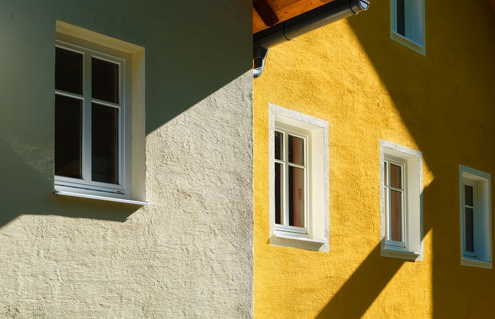
Warm hues (such as golden beige or terracotta) produce snug, sun-warmed atmospheres. They suit north-facing rooms, which are dark and cold.
Cool colors (like seafoam green or frosty gray) cut glare and produce a soothing environment in light, south-facing rooms.
The tone, apart from influencing mood, also has a functional aspect to it, wherein it is used to control light throughout the day.
Finish impacts how a color reflects light:
Selecting the right sheen enhances light flow and improves room durability.
Select the color of the painting in each room according to light: warm for the north, cool for the south, pastels for the east, and earthy for rooms facing west.
Use warm neutrals to counteract the cool natural light. Shades with yellow or beige undertones help the space feel more welcoming.
Plenty of sunlight allows flexibility. Cool tones help temper the brightness without washing it out.
Morning light is strong and fades in the afternoon. Pastels balance both conditions well.
These get intense golden light in the evening. Muted, earthy colors or soft blushes can soften the glare.
The space can be planned to be light and airy beyond the color of the paint. The ceiling, molding, and flooring help to allow the most amount of natural lighting and style consistency throughout the residence.
Painting ceilings with a light shade helps reflect light downward.
Recommended options:
Matte finishes work best to avoid distracting glare and blend seamlessly with walls.
Trim can either sharpen a room’s lines or soften its feel, depending on color and sheen.
For light walls, crisp white trims add brightness. For moodier palettes, warm neutrals like beige or taupe keep the look grounded.
Light floors help reflect light upward. Wood tones like birch or maple, or pale laminate flooring, support bright aesthetics. Dark floors, on the other hand, can absorb light and make a space feel closed-in—better avoided in dim spaces.
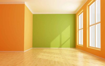
Lightening shades influence mood—yellows uplift, blues and greens soothe. Employ warm colors in moderation and use the rule of 60-30-10 for balance.
Pale oranges and yellows promote energy and warmth, ideal for kitchens and dining. They mimic the sun, improving mood and stimulating vitality in a room.
Blues and greens are calming colors, and they will therefore work well in the bedroom, reading room, or office settings. Pale blue is soothing, and gentle greens soothe and stimulate.
Reds and burnt oranges bring vibrancy. While strong, these should be used in a discriminating way—perhaps an accent wall or in furnishings—so that the room is stimulating but not overwhelming.
Employing the 60-30-10 Rule—60% dominant, 30% secondary, and 10% accent—balances the palette evenly to the eye.
Paint can look different depending on light and undertones. Test colors in your space throughout the day to avoid surprises.
What looks great in a showroom may not translate well at home. Always test colors under changing daylight conditions.
Artificial lighting skews color temperature. Soft white bulbs can yellow crisp whites, while LEDs can cool warm neutrals. Test under both lighting types.
Bold colors shrink space visually. In rooms with little natural light, lighter hues reflect more brightness and keep the area open.
A neutral can lean pink, green, or blue depending on undertones and surroundings. Testing large swatches at different times of day helps avoid clashing.

The layering of natural and artificial light adds brightness and openness to any room. Mirrors, reflective surfaces, and all light sources—ambient, task, and accent—are grouped to reflect and scatter the light.
Enhanced through color and high-LRV wall finishes, deliberate lighting makes interior spaces feel more open and spacious.
Understanding how natural light impacts color and finish can be a home run with the appearance and ambiance of your home. Colors used correctly aren’t just about being pleasing to the eye—colors create depth in a room, raise the space, and highlight its best feature.
Let us help you bring out the best in your home’s natural light. At TurnKey Painters, we’ll guide you with our expertise to choose colors and finishes that brighten your space and reflect your style. Reach out to us today—let’s make every room shine together.