

You can add bold colors in exciting methods without overwhelming the space. You can create visual interest and maintain harmony by placing them deliberately, balancing them with neutrals, and considering natural light.
Accent walls, thoughtfully chosen furniture, or bright cabinetry can all accomplish this. And you can use the right advice and a good touch to create vibrant and inviting designs with bold colors in your home.
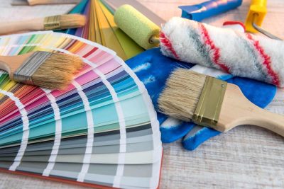
For better results, contact us at TurnKey Painters to help you with your color selection.

Bold colors bring depth, vibrancy, and uniqueness to spaces while enhancing overall design. By being intentional about their placement, balance, and purpose, we can create a thoughtful aesthetic that feels complete.
Colors have a great impact on one’s emotions or energy. Shades like royal red, azure blue, or sunflower yellow create soothing or energizing ambiences.
For instance, energizing yellow could be an accent wall in a kitchen, exuding a sense of zeal, whereas a calming vibe would overpower its deep navy blue in the bedroom. Brilliant colors are given energy when set against subdued tones; they bring warmth and approachability without being an overpowering presence in the space.
Bold colors furnish the easiest and least expensive style vocabulary. Jewel-tone rugs and patterned pillows are brilliant to liven any neutral room. Smaller spaces can feel cozy and cocooning in rich colors. Painting your kitchen might seem terrifying, but brave art or textiles can help you prototype ideas without a long commitment.
Creative manipulation of rich tones can transform simple spaces into striking experiences. The contrasting effect of a drama-infused accent wall and calming furnishings will highlight a mood, while bold hues in such smaller accessories as drapes or carpets will provide dramatic accents. And art is key to tying together the riot of strong colors.
Using bold colors in your home requires a thoughtful approach to color theory. Find balance and harmony without overwhelming the space. By exploring these concepts step by step, you can blend creativity with practicality.
The color wheel is a basic graphic representation of how colors interact with each other. It classifies colors as primary (such as red, blue, and yellow), secondary (such as green, orange, and violet), and tertiary, which serve only as a general guide to pair colors.
Complementary colors create vivid contrasts, such as blue and orange, while analogous colors provide a more restful feel, such as blue, green, and teal. The color wheel is handy for quickly narrowing down your options when allowing bright colors to be used.
Analogous schemes, which utilize colors on neighboring sections of the wheel, are soothing, making them congruent for bedrooms and workplace areas; complementary do just the opposite, putting excessive emphasis on two contrasting colors that should, ideally, be used within more lively areas, like family rooms. An example would be deep navy with burnt orange for a rich, energetic theme.
A monochromatic color scheme consists of one color in different tints and shades, assuring a scheme that is harmonious and still interesting. Glamorous but dramatic can be achieved with dark emerald green and light greens.
Color proportions are simplified with the 60-30-10 rule: the dominant color is 60%, the secondary one is 30%, and the accent color is 10%. For example: cool taupe, 60%; navy, 30%; mustard yellow accents, 10%.
These proportions create a quite structured contrast: cool neutral colors suggest calmness, while warm tones add a touch of emphasis. Gray and taupe are examples of neutral colors that can ground more vivid options to create balance and allow a continuous flow throughout the space.
Using bold colors can enhance your home’s vibrancy and personality. Strategic planning is essential for creating a harmonious and welcoming atmosphere. Consider important factors like space, lighting, and functionality to use bold colors effectively without overwhelming the area.
The understanding of space and light has to do with assessing the dimensions and light sources of a room. Bold colors, when in small spaces, could appear even bolder or more intense in some cases, or under artificial light.
Conversely, opt for warm, rich colors like terracotta or mustard in low-light areas. Bright, well-lit rooms can handle an elegant application of tired colors such as navy blue or emerald green. Balance bold coloring with neutral walls, ceilings, or floors.
Soft sleep-inducing colors such as tinted blues and greens are appropriate for bedrooms, whereas energetic colors such as deep red or orange are for the living room. In the kitchen, dark blue tones or teal draw inspiration from the plant world while being softened by soft vanilla or white quartz.
Use bold colors to highlight specific objects within the space, such as an accent wall, colorfully upholstered sofas, or vibrant artwork. Provide a counterbalance with toned-down elements such as beige or white walls, thus preventing visual chaos.
When you can, sample paint on your walls or furniture as an aid for this decision. Consider how colors look in different lighting and at various times of the day to ascertain that they fit into your overall design.
The color choice you will make depends on what type of mood you intend to set, whether it is vibrant, calm, or elegant. The ideal bold color will strengthen your connection to the space while at the same time contributing to the decor.
Bold colors can enhance a room’s personality, creating excitement without being overwhelming if balanced correctly. Here are practical ways to incorporate them:
An accent wall allows you to play with bold colors without overwhelming the rest of the room. One deep wall painted in rich shades, such as deep teal or fiery red, can become a glorious focal point.
Keep the adjacent walls in softer tones like beige or light gray and bring in some natural textures to complement them. Notice how dark and bold colors create a serene cocoon effect in bedrooms.
Accent pieces such as a mustard chair or cobalt-blue sofa add a punch without compromising on function. These can be offset with other large items, like coffee tables and rugs, muted in color. In the kitchen, consider a bold island or two-tone countertop for a visual punch, paired with contrasting natural materials.
Throw pillows, lamps, and artwork allow you to be more flexible with bold colors. For instance, orange and blue accessories will enliven any area with neutral walls. The 60-30-10 ratio—where 60 is neutral, 30 bold, and 10 accent colors—brings harmony.
Using bold colors intentionally will energize and define a space. By balancing these with neutral tones or textures, we can get bold yet inviting. Small bits, such as colorful pillows or painted doors, allow us to take manageable risks.
Use bold colors with purpose to enhance your environment. Be it accenting or going for a bold palette, we can get the job done! Do reach out to us at TurnKey Painters to start shaping your vision.


